This project was an exercise in really understanding the meaning of a given word and also the world in which that word lives. We had to illustrate the meaning of the word on a poster, while advertising a theoretical exhibition in the Fine Arts Center.
Thursday, September 15, 2011
kitchen of meaning
This project was an exercise in really understanding the meaning of a given word and also the world in which that word lives. We had to illustrate the meaning of the word on a poster, while advertising a theoretical exhibition in the Fine Arts Center.
Labels:
2011,
class_of_2013,
gdes_II,
kitchen_of_meaning,
kristina_mann,
poster,
spring
dada poster
We were first given a specific art or design movement and did research to fully understand it.We were then instructed to create a poster advertising a showcase of that movement at the Blanton museum using buttons. I created a system in which the exhibit was open Wednesday through Sunday for 3 weeks, where members received buttons on Wednesday, Friday, and Sunday and non-members on the other two to play off of the exclusivity of the Dada Movement. Each week, the buttons would showcase a different key aspect of the movement. Aside from learning how to assemble buttons, a challenge was designing on such a small scale.
Labels:
2011,
class_of_2013,
gdes_II,
identity_series,
kristina_mann,
spring
tasa conference book
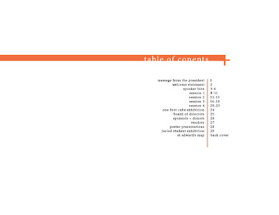
Before embarking on the East Side book, this was the largest amount of text/content we had encountered for a project. It acted as the intermediate phase between the simple type specimens and the arduous east side books. The task was to create a program for people at an art conference.
Labels:
activity_booklet,
advance_typography,
book,
class_of_2013,
kristina_mann
Friday, March 25, 2011
instructional design
For this project, I envisioned this instructional piece to be apart of a series of flipbooks, sold as novelties or coffee table books. I chose a flipbook so users could have something tangible, with written instructions and visuals, but also be able to see the process of folding and unfolding. I believed this would be both fun and instructive for my college student audience.
Labels:
2011,
book,
class_of_2013,
gdes_II,
interactive,
photography,
spring
Wednesday, March 23, 2011
personal geography
perceptual map
In creating this version, I wanted to convey both the intensity and duration of each sense. I used opacity to express the intensity of certain events, where the more opaque icons represent more stimulating things or feelings. The rectangles represent the duration of each sense.
cognitive map
My cognitive map was created based on some of the decisions I make on my way to class and their relationship to various factors. As seen in the map, each determinant influences my decisions, and thus produces different outcomes, or events.
artifact map
For this map, I was influenced by my actual drive to campus and the feeling that I was driving in a single direction on the interstate, ignoring its actual shape and direction. So, in creating the map, I opted to eliminate curves and solely use lines.
Labels:
2010,
artifact_map,
class_of_2013,
cognitive_map,
fall,
gdes_I,
perceptual_map,
personal_geography,
poster
words in motion
When I thought of the word 'order', I was reminded of communist Soviet Russia. From there, I had the idea of illustrating that notion in the vain of russian constructivism. Furthermore, I illustrated the letters arranging themselves in order though quick, precise movements.
For this piece, I just thought of different things that were playful and incorporated them into the animation. The ideas that influenced this animation were a puppet show, a person playfully surprising another person, and a child playing with toys.
Labels:
2011,
advance_typography,
class_of_2013,
motion,
spring,
words_in_motion
critical mass
For this project, I used the automotive industry as an allegory for genetic modification, where the cars were metaphors for genetically modified crops. Rather than illustrating the entire car manufacturing process, I thought it would be interesting to juxtapose the cars with various images of cells as well as the syringe.
Labels:
class_of_2013,
critical_mass,
fall,
image_methodology,
motion
blue squares
Although previous projects forced me to learn after effects and become familiar with motion, this exercise aided in both refining my craft and teaching me new effects.
Labels:
2011,
advance_typography,
blue_squares,
class_of_2013,
motion,
spring
material studies
For this project, we had to explore various materials through the creation of typefaces. In constructing the various letter forms, we were forced to analyze the materials and notice the nuances that set it apart from others. For example, I took advantage of the malleability of plastic toothbrushes after being boiled. I ended up choosing the keys as my final material because of the fact that they could actually be used once the letters were constructed. Thus, I chose to illustrate that in the form of an animation.
Labels:
2010,
class_of_2013,
fall,
image_methodology,
material_studies,
motion
Subscribe to:
Posts (Atom)